Templates
Content: slots and blocks
The content a design gives a template: slots (JSX someone writes, inside limits), blocks (approved section types, picked and ordered as data), and annotated templates.
Most fields hold a value. A template can also leave room for content: whole
sections of a design. There are two ways, and they differ in who decides how the content looks. Both are declared in the
template’s fields, beside its values:
 SlotA region someone writes freely, as JSX. The template limits which elements and styles it takes.
 BlocksSections picked from the types the template approves, and ordered, as data. Their look is the template's.
| A template opens | For | Whoever fills it gives |
|---|---|---|
| A field | One typed value | Text, a date, a list, an image |
| A slot | Content someone writes | JSX, with only the elements and styles the template allows |
| Blocks | Sections picked and ordered | Data: each block’s type and its fields |
Slots
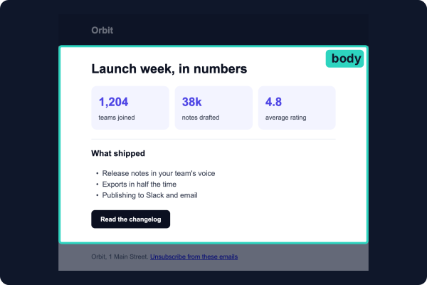
A slot is JSX the filler writes, inside limits the template sets. This newsletter’s header and footer are locked, its title is a text field, and its body is a slot.
The template places the slot in a built-in element bound to it, its host (<Section field="body">), and everything
under the host is the slot’s:
// templates/newsletter.tsx
import { Button, Column, Email, Heading, Link, Section, Text, defineTheme, prop } from "@hyper-elements/react";
import { field, template } from "@hyper-elements/react/template";
import { lint } from "@hyper-elements/lint";

// The brand's look for what an issue is written with: the content sets no styles of its own.
const brand = defineTheme({
  elements: {
    Heading: { color: "#0b1020", by: { level: { 1: { fontSize: 30, lineHeight: 1.2 }, 2: { fontSize: 20, lineHeight: 1.3 } } } },
    Text: { color: "#3b4254", fontSize: 16, lineHeight: 1.6 },
    Button: { backgroundColor: "#4f46e5", color: "#ffffff", borderRadius: 8, padding: [12, 20], fontWeight: 700 },
    Column: { gap: 12 },
  },
});

export default template({
  id: "acme.Newsletter",
  version: "1.0.0",
  label: "Orbit newsletter",
  guidance: "Orbit's monthly newsletter. Friendly and plain: sentence case, no exclamation marks, no emoji.",
  root: "Email",
  fields: {
    subject: prop.text({ label: "Subject", required: true, maxLength: 70 }),
    preview: prop.text({ label: "Preview text", required: true, maxLength: 120 }),
    // What the issue's writer writes: these elements only, in the brand's look, with one or two buttons.
    body: field.slot({
      label: "Body",
      required: true,
      allow: [Column, Heading, Text, Button, Link],
      styles: "none",
      count: { Button: { min: 1, max: 2 } },
      guidance: "One to three short sections, each a Heading and a Text.",
    }),
  },
  rules: {
    plugins: { lint: lint({ kind: "marketing" }) },
    // An unsubscribe link, link text that says where it goes, a language, and nothing wider than the email.
    require: { lint: ["unsubscribe", "link-text", "lang"], core: ["layout/overflow"] },
    // Links go to Orbit's own domains.
    links: { domains: ["orbit.example", "*.orbit.example"] },
    root: { lang: true, previewText: true },
  },
  example: {
    subject: "What's new in Orbit this month",
    preview: "Faster exports, release notes in your voice, and an invitation to our open house",
    body: (
      <Column>
        <Heading level={2}>Faster exports</Heading>
        <Text>Exports now finish in half the time, with no settings to change.</Text>
        <Button href="https://orbit.example/changelog">Read the changelog</Button>
      </Column>
    ),
  },
  render(v) {
    return (
      <Email lang="en" previewText={v.preview} theme={brand} style={{ backgroundColor: "#eef0f6" }}>
        <Section style={{ backgroundColor: "#0b1020", padding: [20, 32] }}>
          <Text style={{ color: "#ffffff", fontSize: 20, fontWeight: 700 }}>Orbit</Text>
        </Section>
        <Section style={{ backgroundColor: "#ffffff", padding: [32, 32, 8] }}>
          <Heading field="subject" level={1}>{v.subject}</Heading>
        </Section>
        <Section field="body" style={{ backgroundColor: "#ffffff", padding: [16, 32, 32] }}>
          {v.body}
        </Section>
        <Section style={{ padding: [20, 32] }}>
          <Text style={{ fontSize: 14, color: "#5b6478" }}>
            Orbit, 1 Main Street. <Link href="https://orbit.example/unsubscribe">Unsubscribe from these emails</Link>
          </Text>
        </Section>
      </Email>
    );
  },
});
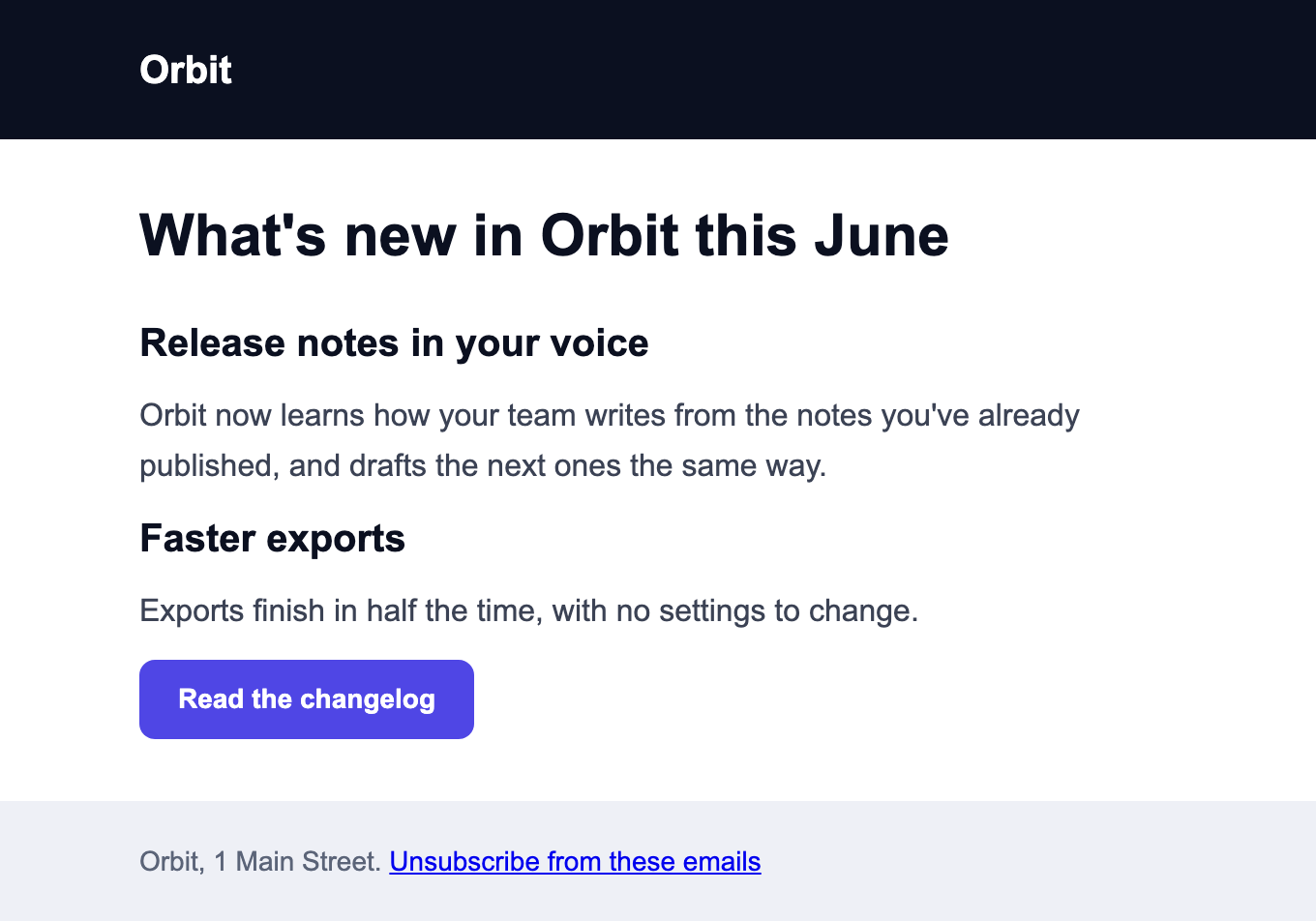
An issue is the template with its values. What’s inside body is the writer’s:
// designs/june.tsx
import { Button, Column, Heading, Text } from "@hyper-elements/react";
import Newsletter from "../templates/newsletter";

export default () => (
  <Newsletter
    subject="What's new in Orbit this June"
    preview="Release notes in your voice, faster exports, and an invitation to our open house"
    body={
      <Column>
        <Heading level={2}>Release notes in your voice</Heading>
        <Text>Orbit now learns how your team writes from the notes you've already published, and drafts the next ones the same way.</Text>
        <Heading level={2}>Faster exports</Heading>
        <Text>Exports finish in half the time, with no settings to change.</Text>
        <Button href="https://orbit.example/changelog">Read the changelog</Button>
      </Column>
    }
  />
);
An issue that styles its own heading and adds a table is refused, with what to change:
// designs/off-brand.tsx
import { Button, Column, Heading, Table, TableCell, TableRow, Text } from "@hyper-elements/react";
import Newsletter from "../templates/newsletter";

export default () => (
  <Newsletter
    subject="Huge summer sale"
    preview="Everything is on sale this week, for a short time only, across the whole store"
    body={
      <Column>
        <Heading level={2} style={{ color: "#ff0066" }}>Everything must go</Heading>
        <Table><TableRow><TableCell><Text>Pro plan</Text></TableCell><TableCell><Text>50% off</Text></TableCell></TableRow></Table>
        <Button href="https://orbit.example/sale">Shop the sale</Button>
      </Column>
    }
  />
);
npx hyper-elements check designs/off-brand.tsx✗ designs/off-brand.tsx (Email)
error template/slot-style at root.children[2].children[0].children[0].style.color: acme.Newsletter's body takes no styles of its own (styles: "none"): use the theme's named styles (style={{ apply: [...] }}) and variants, not color
error template/slot-element at root.children[2].children[0].children[1]: A Table isn't one of the elements acme.Newsletter's body takes (Column, Heading, Text, Button, Link)
review body: One to three short sections, each a Heading and a Text.
review acme.Newsletter: Orbit's monthly newsletter. Friendly and plain: sentence case, no exclamation marks, no emoji.
1 design: 1 error, 0 warnings, 0 skippedWhat a slot allows
Two options set a slot’s limits: which elements its content may use (allow), and how it may style them (styles).
| Option | What it sets | Refused as |
|---|---|---|
allow: [Column, Heading, …] |
The elements the content may use, given as the elements themselves | template/slot-element |
allow: "all" |
Every built-in the template’s root may hold, but the roots and Html. deny: [Table, Video] takes some out; ["all", ProductCard] adds your own |
template/slot-element |
count: { Button: { min: 1, max: 2 } } |
How many of a type, counting what’s shown at some width | template/slot-count |
styles has three settings, from the brand’s look only to anything:
styles |
The content may | An example |
|---|---|---|
"none" |
Set no style of its own. It gets the theme’s look for each element, and may use the theme’s named styles and variants where the theme has them | <Text> and <Button variant="secondary">, never style={{ color: … }} |
"theme" (the default) |
Style freely, with every brand value taken from the theme | style={{ color: token("colors.primary"), textAlign: "center" }} |
"free" |
Use any style | style={{ color: "#ff0000" }} |
Under "theme", the brand’s values come from the template’s theme: token("colors.primary") stands
for the theme’s primary color. A value written out where a token belongs is refused, with the style named:
import { token } from "@hyper-elements/react";

<Text style={{ color: token("colors.primary") }}>Paid</Text>   // taken: the theme's color
<Text style={{ textAlign: "center" }}>Paid</Text>              // taken: not a brand value
<Text style={{ color: "#ff0000" }}>Paid</Text>                 // template/slot-style: color is a literal
<Column style={{ padding: 12 }}>…</Column> // template/slot-style: each side a token() or 0- The newsletter above is
"none", and its theme only gives each element its look. So its content sets no style at all, and has no named style or variant to use. - A brand value is a color, a font, a spacing (
padding,gap,rowGap), a radius, a border’s color, andfontSize,lineHeightandletterSpacing, instyleand in itsmobileandhoverblocks. Alignment, widths and the rest aren’t. - A built-in is allowed by its type, a custom element by its definition. Content that
defines its own
acme.ProductCardis refused (“not the template’s”), and its render never runs. A root andHtmlare never allowed. allow: "all"widens with Elements: a later release that adds a built-in adds it to the slot. A template that wants a fixed set across upgrades writes a list.- Content never sets
attrs(template/slot-attrs), or, under"none"and"theme",tokensortheme(template/slot-tokens). Afieldinside it is its own (template/slot-field): the template reads no binding there. - The content must be what its host may hold, as any children are. A Section holds a Column, a Row or any
content element (a Text, a Button), but not another Section. Several elements go in a
Columnor a fragment (<>…</>), not an array. - The subject line isn’t the design’s. The newsletter’s
subjectfield is its title, drawn in the email; the subject an inbox shows is set where the email is sent.
The template never sees the content
A template’s render runs with a mark in the slot’s place, so its locked parts can’t depend on what’s written there.
The content is rendered on its own (it sees none of the template’s React context) and put in at the mark. The mark
goes in exactly one element bound to the slot (template/slot-host).
A slot stored as data
A values file is JSON, so it can’t hold JSX. It stores a slot one of two ways:
| Stored as | It is | To check it |
|---|---|---|
{ "module": "./_slots/june.body.tsx" } |
A module whose default export renders the content | The module has to be run first, and what it rendered given to check() in fragments. The command line does that, in a process of its own |
{ "fragment": … } |
The content already rendered and recorded as data, by captureFragment() |
check() reads it itself |
A slot module is a component with nothing around it:
// designs/_slots/june.body.tsx
import { Button, Column, Heading, Text } from "@hyper-elements/react";

export default () => (
  <Column>
    <Heading level={2}>Faster exports</Heading>
    <Text>Exports finish in half the time.</Text>
    <Button href="https://orbit.example/changelog">Read the changelog</Button>
  </Column>
);
From code, captureFragment() renders content and records it. Give it as the slot’s value, or in fragments for a
slot stored as its module:
import { captureFragment } from "@hyper-elements/react";
import Body from "./designs/_slots/june.body";

const body = captureFragment(<Body />);
newsletter.check({ subject, preview, body: { fragment: body } });                                              // the content itself
newsletter.check({ subject, preview, body: { module: "./_slots/june.body.tsx" } }, { fragments: { body } });   // the module's, run here
toValuesFile() stores a slot’s JSX as its fragment. Without a module’s content, check() gives
template/slot-unloaded. Store a module where people edit the content as a file; store a fragment where a tool wrote
it and nothing should run to read it back.
Blocks
prop.blocks(types, { min, max }) is a list of approved section types, each a prop.object(). The filler picks
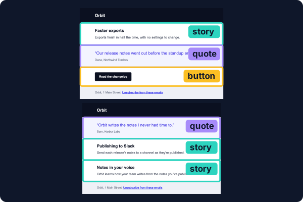
which, in what order, and fills them; the look is the template’s. These two digests are one template, with three types:
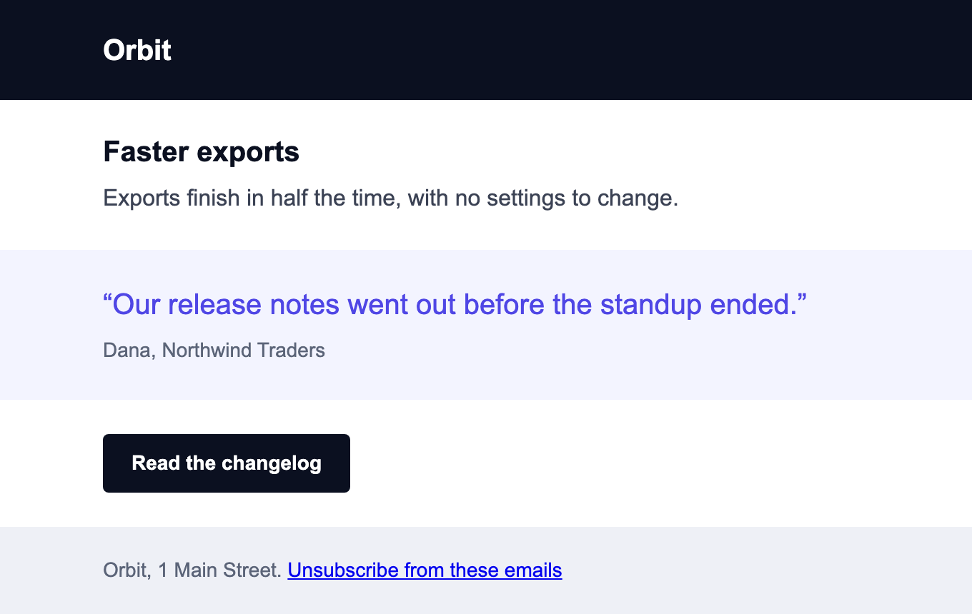
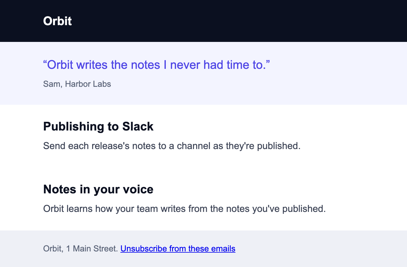
Each digest’s body is a list: every item names its type and gives that type’s values. Monday’s
(digest-monday.json):
{
  "preview": "Faster exports, what a customer said about them, and the changelog",
  "body": [
    { "type": "story", "title": "Faster exports", "text": "Exports finish in half the time, with no settings to change." },
    { "type": "quote", "text": "Our release notes went out before the standup ended.", "by": "Dana, Northwind Traders" },
    { "type": "button", "label": "Read the changelog", "href": "https://orbit.example/changelog" }
  ]
}
The template lists the types, and draws each one:
// from templates/digest.tsx
body: prop.blocks(
  {
    story: prop.object({ title: prop.text({ label: "Title", required: true, maxLength: 60 }), text: prop.text({ label: "Text", required: true, maxLength: 240 }) }, { label: "Story" }),
    quote: prop.object({ text: prop.text({ label: "Quote", required: true, maxLength: 140 }), by: prop.text({ label: "Who said it", required: true, maxLength: 60 }) }, { label: "Quote" }),
    button: prop.object({ label: prop.text({ label: "Label", required: true, maxLength: 30 }), href: prop.link({ label: "Link", required: true }) }, { label: "Button" }),
  },
  { label: "Body", required: true, min: 1, max: 6 },
),
// from templates/digest.tsx
{v.body.map((block, i) =>
block.type === "story" ? (
<Section key={i} id={`story-${i}`} style={{ backgroundColor: "#ffffff", padding: [24, 32], gap: 8 }}>
<Heading level={2} field={`body[${i}].title`} style={{ fontSize: 20, color: "#0b1020" }}>{block.title}</Heading>
<Text field={`body[${i}].text`} style={{ color: "#3b4254" }}>{block.text}</Text>
</Section>
) : block.type === "quote" ? (A block of a type the template doesn’t list is refused, with the types it has:
npx hyper-elements design set designs/digest-monday.values.json "body=[{\"type\":\"video\"}]"✗ designs/digest-monday.values.json: not written
error template/value at values.body[0]: A block is { type, … } with type "story" or "quote" or "button", not "video"The whole template: templates/digest.tsx
// templates/digest.tsx
import { Button, Email, Heading, Link, Section, Text, prop } from "@hyper-elements/react";
import { template } from "@hyper-elements/react/template";
import { lint } from "@hyper-elements/lint";

export default template({
  id: "acme.Digest",
  version: "1.0.0",
  label: "Orbit digest",
  guidance: "A short digest. Lead with the news; one button at most.",
  root: "Email",
  fields: {
    preview: prop.text({ label: "Preview text", required: true, maxLength: 120 }),
    // Open: which sections, and in what order. Each is one of three approved types, filled as data.
    body: prop.blocks(
      {
        story: prop.object({ title: prop.text({ label: "Title", required: true, maxLength: 60 }), text: prop.text({ label: "Text", required: true, maxLength: 240 }) }, { label: "Story" }),
        quote: prop.object({ text: prop.text({ label: "Quote", required: true, maxLength: 140 }), by: prop.text({ label: "Who said it", required: true, maxLength: 60 }) }, { label: "Quote" }),
        button: prop.object({ label: prop.text({ label: "Label", required: true, maxLength: 30 }), href: prop.link({ label: "Link", required: true }) }, { label: "Button" }),
      },
      { label: "Body", required: true, min: 1, max: 6 },
    ),
  },
  rules: {
    plugins: { lint: lint({ kind: "marketing" }) },
    require: { lint: ["unsubscribe", "lang"] },
    links: { domains: ["orbit.example", "*.orbit.example"] },
  },
  example: {
    preview: "This week at Orbit: one story, and where to read the rest of it",
    body: [
      { type: "story", title: "Faster exports", text: "Exports finish in half the time, with no settings to change." },
      { type: "button", label: "Read the changelog", href: "https://orbit.example/changelog" },
    ],
  },
  render(v) {
    return (
      <Email lang="en" previewText={v.preview} style={{ backgroundColor: "#eef0f6" }}>
        <Section style={{ backgroundColor: "#0b1020", padding: [20, 32] }}>
          <Text style={{ color: "#ffffff", fontSize: 20, fontWeight: 700 }}>Orbit</Text>
        </Section>
        {/* Each block's look is the template's: its type picks which. */}
        {v.body.map((block, i) =>
          block.type === "story" ? (
            <Section key={i} id={`story-${i}`} style={{ backgroundColor: "#ffffff", padding: [24, 32], gap: 8 }}>
              <Heading level={2} field={`body[${i}].title`} style={{ fontSize: 20, color: "#0b1020" }}>{block.title}</Heading>
              <Text field={`body[${i}].text`} style={{ color: "#3b4254" }}>{block.text}</Text>
            </Section>
          ) : block.type === "quote" ? (
            <Section key={i} id={`quote-${i}`} style={{ backgroundColor: "#f3f4ff", padding: [24, 32], gap: 8 }}>
              <Text field={`body[${i}].text`} style={{ fontSize: 20, lineHeight: 1.4, color: "#4f46e5" }}>“{block.text}”</Text>
              <Text field={`body[${i}].by`} style={{ fontSize: 14, color: "#5b6478" }}>{block.by}</Text>
            </Section>
          ) : (
            <Section key={i} id={`button-${i}`} style={{ backgroundColor: "#ffffff", padding: [24, 32] }}>
              <Button field={`body[${i}].label`} href={block.href} style={{ backgroundColor: "#0b1020", color: "#ffffff", padding: [12, 20], fontWeight: 700 }}>{block.label}</Button>
            </Section>
          ),
        )}
        <Section style={{ padding: [20, 32] }}>
          <Text style={{ fontSize: 14, color: "#5b6478" }}>
            Orbit, 1 Main Street. <Link href="https://orbit.example/unsubscribe">Unsubscribe from these emails</Link>
          </Text>
        </Section>
      </Email>
    );
  },
});
As TSX, the same list is the template’s prop: <Digest preview="…" body={[{ type: "story", title: "…", text: "…" }]} />.
Blocks can hold any field, an image with its limits among them:
fields: {
  body: prop.blocks(
    {
      hero: prop.object({ title: prop.text({ label: "Title", required: true }), image: field.image({ label: "Image", fit: "contain" }) }, { label: "Hero" }),
      quote: prop.object({ text: prop.text({ label: "Quote", required: true, maxLength: 120 }) }, { label: "Quote" }),
    },
    { label: "Body", required: true, min: 1, max: 6 }
  ),
},
// values: { body: [{ type: "hero", title: "Orbit is live" }, { type: "quote", text: "Ship small." }] }typenames each block’s type, so a block type can’t have a field namedtype(template/block-type).- An unknown or missing type is
template/value, naming the types. - Limits and bindings inside a block work as anywhere:
body[0].image.
Whatever fills a slot or a list of blocks, the template’s rules are checked on the finished design.
Annotated templates
A template with one size and fields of text, links, images and slots can be written as the design itself, with what’s
open marked where it is. It’s open and design in place of fields and render (the theme and the header and
footer components are left out here):
import { field, open, template } from "@hyper-elements/react/template";

const title = open(prop.text({ label: "Title", required: true, maxLength: 70 }));
const body = open(field.slot({ label: "Body", required: true, allow: "all", styles: "theme" }));

export default template({
  id: "acme.Announcement",
  version: "1.0.0",
  rules: { plugins: { lint: lint({ kind: "marketing" }) }, require: { lint: ["unsubscribe"] } },
  open: { title, body },
  design: (
    <Email width={600} theme={brand}>
      <BrandHeader />
      <Heading field={title}>What's new at Acme</Heading>
      <Section field={body}>
        <Text>Three things shipped this week.</Text>
      </Section>
      <BrandFooter />
    </Email>
  ),
});
A marker goes on a built-in written in design itself, and what the marked node holds is the example:
| A marker for | Goes on |
|---|---|
| A text field | A Heading, Text, ListItem, Button or Link holding its example text |
| A link | A Link’s or Button’s href |
An image (field.image()) |
An Image’s src |
| A slot | The node that holds its content |
A template with formats, lists, blocks or computed values uses fields and render.