Core concepts
Designs
A design is JSX with one root: Email, Page, Document or Canvas. The root decides the output. Root props, what goes inside, your own functions, and sharing content between roots.
A design is JSX with one root. The root decides the output: an email, a web page, a PDF or an image.
import { Email, Heading, Text } from "@hyper-elements/react";

export default function Welcome() {
  return (
    <Email width={600} previewText="Thanks for signing up" lang="en">
      <Heading>Welcome</Heading>
      <Text>Thanks for signing up.</Text>
    </Email>
  );
}
That is a whole email. A root stacks its children down its content width, centered in the window, so you don’t need a Row, a Column or a container to start.
To see it, await render(<Welcome />) gives its HTML (Rendering), and npx hyper-elements dev shows it in a browser as you edit (Command line). New here? Quickstart installs the package and sends a first email.
The four roots
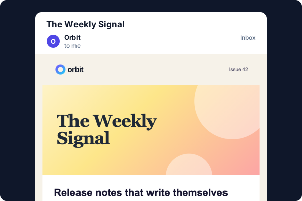 EmailEmail-safe HTML and its plain text, from
render().
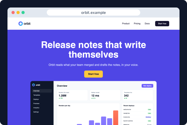 PageA responsive web page, from
render().
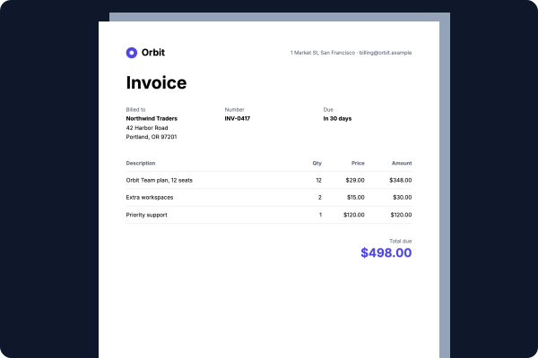 DocumentA PDF from
renderPdf(), and print-ready HTML from render().
 CanvasA PNG or an SVG of a fixed size, from
renderImage().
What’s inside each frame is real output: a newsletter, a landing page, an invoice and a social card, all written with the same elements. Only the root differs.
| Root | Its width |
|---|---|
Email |
width, 600 by default |
Page |
width, 1200 by default: the widest the content gets |
Document |
From its size, orientation and margin |
Canvas |
width 1200 and height 630 by default |
A design has exactly one root, with nothing around it. A <div> around the root is an error.
Root props
| Prop | Roots | What it does |
|---|---|---|
width |
Email, Page, Canvas | The content width in px |
height |
Canvas | The image’s height in px. What’s past it is cut |
previewText |
Shown after the subject in inbox lists, not in the email | |
description |
Page | The page’s meta description |
title |
all | The document’s <title>, shown in a browser tab and by some email clients |
lang |
all | The language, as a BCP 47 tag ("en", "ar") |
dir |
all | "ltr", "rtl" or "auto". Text starts on that side unless you align it |
fonts |
all | The font files the design loads. See Styles |
theme |
all | The brand’s colors, fonts and defaults. See Themes |
size |
Document | "A3", "A4", "A5", "Letter", "Legal" or "Tabloid", "A4" by default |
orientation |
Document | "portrait" or "landscape", "portrait" by default |
margin |
Document | Around each page’s content, 48px on each side by default (96px to the inch) |
A root’s width is a prop, not a style. An Email, a Page and a Document have no padding of their own: put padding on a Column (a card) or a Section (a band) inside:
<Email width={640} style={{ backgroundColor: "#f4f4f5" }}>
  <Column style={{ backgroundColor: "#ffffff", padding: 32 }}>
    <Text>The card has the padding, not the root.</Text>
  </Column>
</Email>
The root’s style takes the text styles every block inherits (color, fontFamily, fontSize, lineHeight and the rest), backgroundColor, gap and alignItems. A Canvas, which is one fixed box, also takes padding and justifyContent. See Styles.
What goes inside
Everything in a design is an element. The ones a root, a Section or a Column stacks are called blocks: the layout elements, the text elements and the rest of the first four rows below. What goes inside text, or inside a List, a Table or an Svg, isn’t a block.
| Kind | Elements |
|---|---|
| Layout | Section, Row, Column, Grid, Layer |
| Text | Heading (level 1 to 6), Text |
| Inside text | Span, Link, LineBreak, MergeTag |
| Other blocks | Button, Image, Divider, List, Table, Video, Social, Menu, Svg (not in an Email), Html |
| Parts | ListItem in a List; TableRow and TableCell in a Table |
Shapes, in an Svg |
Rect, Circle, Ellipse, Line, Polygon, Path |
| Document parts | Document.Page, PageBreak, PageHeader, PageFooter, PageNumber |
Layout covers the first row. Each element’s page lists its props and styles.
Text is elements, not HTML
Words go in a Heading or a Text. Inside one, a Span styles a run, a Link links one, a LineBreak breaks the line and a MergeTag writes a merge tag (a placeholder your sending service fills in, such as a first name):
<Text>
  Order <Span style={{ fontWeight: 700 }}>#10482</Span> ships tomorrow.
  <LineBreak />
  <Link href="https://example.com/orders/10482">Track it</Link>
</Text><b>, <br>, <div> and other HTML elements in a design are errors (jsx/markup), and so are words straight in a root or a Column. For markup no element says, there’s <Html>.
Images
An Image takes its file’s size along with its address, src={{ src, width, height }}, in the file’s own px. Its style.width is the size it’s shown at:
<Image
  src={{ src: "https://example.com/logo.png", width: 240, height: 80 }}
  alt="Acme"
  style={{ width: 120 }}
/>
Ids
Every element takes an id. It starts with a letter, holds letters, digits, _ and -, and is used once in a design. It’s written as the HTML id, and it’s how templates and tools name one part of a design.
Your own functions
A function that returns elements is a part of your own, to use wherever those elements can go. It’s a React component, so write designs the way you write the rest of your React app:
import { Column, Email, Heading, Text } from "@hyper-elements/react";

function Footer({ company }: { company: string }) {
  return (
    <Text style={{ fontSize: 12, color: "#71717a", textAlign: "center" }}>
      {company}
    </Text>
  );
}

interface Order {
  name: string;
  items: string[];
}

export function OrderShipped({ name, items }: Order) {
  return (
    <Email previewText="Your order is on its way" style={{ gap: 16 }}>
      <Column style={{ gap: 8 }}>
        <Heading level={1}>On its way, {name}</Heading>
        {items.map((item) => (
          <Text key={item}>{item}</Text>
        ))}
      </Column>
      <Footer company="Acme Inc." />
    </Email>
  );
}
render() runs your functions with React, so props, hooks, Context, Fragments, arrays and conditions work as they do in React.
A function that’s async or suspends is an error (jsx/async): render() doesn’t wait for it. Fetch your data first and pass it in as props.
Data you pass as children or props is escaped when the output is written, so a customer’s name can’t add markup.
For a part with typed props that are checked like a built-in element’s, see Custom elements.
Share content between roots
Write the content once, as a function:
export function ReceiptContent({ receipt }: { receipt: Receipt }) {
  return (
    <Column style={{ backgroundColor: "#ffffff", padding: 32, gap: 16 }}>
      <Heading level={1} style={{ fontSize: 28 }}>Payment receipt</Heading>
      <Text>
        Invoice <Span style={{ fontWeight: 700 }}>{receipt.number}</Span>
      </Text>
      <Text>
        Thank you, {receipt.customer}. You paid {receipt.total}.
      </Text>
      <Button href={receipt.url}>View invoice</Button>
    </Column>
  );
}
Then give each output its root:
const content = <ReceiptContent receipt={receipt} />;

const email = await render(<Email>{content}</Email>);
const page = await render(<Page width={600}>{content}</Page>);
const printed = await render(<Document size="A4">{content}</Document>);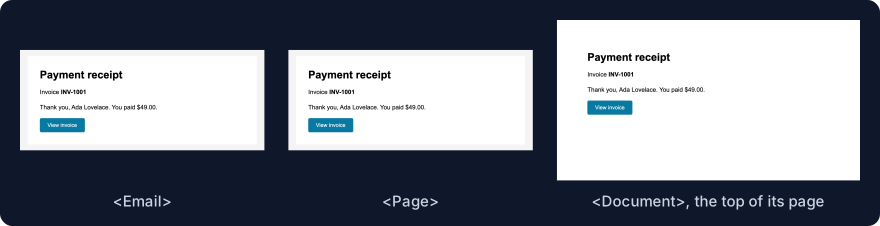
render() needs no mode: the root says what to write. email.html is email HTML, page.html a web page and printed.html print HTML. For the PDF itself, pass the same Document to renderPdf(). See Rendering.
Shared content doesn’t mean identical pixels. An email is written as tables, a page with flexbox, and a document on pages of a fixed size. Each output’s page says what it does differently: Email, Web pages, Documents and PDF, Images.