Templates
Values: fields, images and formats
The values a design gives a template: every kind of field, the rules an image field checks, formats, bindings, values as data and what describe() tells whoever fills a template.
A template’s values are what a design gives it as data. There are three ideas on this page:
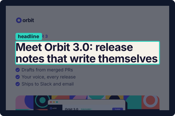 FieldOne typed value: text, a date, a number, a choice, a list. The headline here is one.
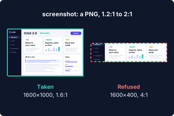 Image fieldA picture, with limits on its shape, size and type. A banner isn't a screenshot.
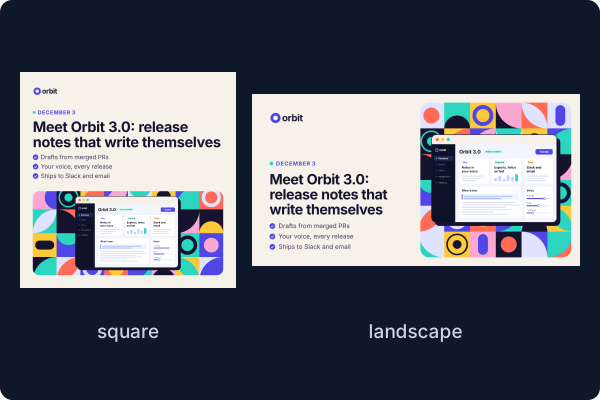 FormatOne of the sizes a template renders at. The same values give every one.
Template examples shows them at work; this page lists each one.
import { prop } from "@hyper-elements/react";
import { field, template } from "@hyper-elements/react/template";
Fields
A field is one open part of a template, declared in its fields. Most hold one typed value, made with a prop helper
from @hyper-elements/react or with field.image() from @hyper-elements/react/template. Two hold content, and have
a page of their own: prop.blocks() and field.slot().
| Field | Its value | Its own options |
|---|---|---|
prop.text() |
Text | maxLength; pattern, a regular expression’s source, matched with the u flag |
prop.date() |
A date, YYYY-MM-DD |
|
prop.number() |
A number | min, max |
prop.choice(options) |
One of the options | |
prop.link() |
A URL | |
prop.list(item, { min, max }) |
A list of one kind of item | Not given, it’s [], and its min applies to that too |
prop.object(fields) |
An object of named fields | Optional and not given, it’s undefined |
prop.blocks(types, { min, max }) |
A list of blocks, each one of the types | See blocks |
field.image(limits) |
An image, { src, width, height } |
See image limits |
field.slot(options) |
JSX someone writes | See slots |
The other prop helpers (a color, a boolean and the rest) are fields too: they’re the ones a
custom element declares its props with.
Every field takes these:
| Option | What it does |
|---|---|
label |
Its name, for people: in messages and in describe() |
required |
A field is required only with required: true. Required text that’s empty, or only spaces, counts as not given (template/required) |
default |
Filled in where the value isn’t given |
guidance |
Plain English for whoever fills it. Never enforced: listed by describe(), and returned by check() as review items for a person to judge |
Lists and objects compose. A field.image() inside a list of objects keeps its limits, at stories[1].image.
A field can’t be named format, key, ref or children (template/field-name): they’re props of the template’s
component.
Image limits
An image field’s value is { src, width, height }, the file’s size in px. Each limit is checked against what can
decide it: the size given, the file, or where the template draws it.
| Limit | It asks | Checked against | Where it fails |
|---|---|---|---|
aspect: { min, max } |
Its width over its height | The size given | template/asset-aspect |
minWidth, minHeight |
Its smallest size in px | The size given | template/asset-pixels |
accepts |
Its type: png, jpeg, gif, svg, webp |
Its name’s extension, then its file | template/asset-type |
transparent |
"required" or "forbidden" |
Its file | template/asset-alpha |
fit: "contain" |
Shown whole, at its own aspect | Where it’s drawn | template/asset-distorted, template/asset-cropped |
fit: "cover" |
Cropped from the center to fill its region | Where it’s drawn | |
maxCrop |
The most a cover image loses from either side, as a share (0.6 is 60%) |
Where it’s drawn | template/asset-cropped |
Some facts can only be read from the file: whether it’s transparent, its true size, its type where its name gives
none. Those are never taken as passed. Each is a note, template/asset-unread, until the file is read: by
checkLayout() given the file, or by the
command line, which reads a file beside the design. A file’s header is read for PNG,
JPEG, GIF and SVG; a WebP is known by its name alone.
fit doesn’t draw anything. It says how the template must show the picture, and the check holds the template to
it:
// contain: sized to fit a box, at the picture's own aspect
<Image field="screenshot" src={v.screenshot} alt="The product" style={fitInside(v.screenshot, { width: 512, height: 320 })} />

// cover: the first child of a Layer fills the Layer's box, cut at its sides or its top and bottom
<Layer style={{ width: 952, height: 420 }}>
  <Image field="artwork" src={v.artwork} alt="" />
  {/* what's drawn over it */}
</Layer>
Layout has more on a Layer.
Bindings
field="…" on a built-in element says which field it shows:
<Heading field="headline">{v.headline}</Heading>
<ListItem field={`features[${i}]`}>{feature}</ListItem>
<Image field="stories[1].image" src={story.image} alt="" />- It’s optional for text. With it, a diagnostic on that node names its
field(incheck()’s result, and in the command line’s--json), so a tool or an agent knows which value to change. Without it, the diagnostic has only the node’s path. - An image with limits needs it: it’s how the template’s checks find the image where it’s drawn.
- A slot needs it on the one element that holds its content (
template/slot-host). - A
fieldthat names no field with a value istemplate/unknown-binding. An image field with rules that no node shows istemplate/unbound, a warning. - A binding inside a custom element’s own render is left out (
field/dropped).
Formats and the example
formatsare a template’s named sizes: a Canvas’s{ width, height, scale }, a Document’s{ size, orientation }. A template with no formats has one size.renderbuilds each one. It gets the format’s name, and writes its root at that size and arranges the design for it. The size is written in both places on purpose: the template checks that whatrenderbuilt is the size its format declares (template/format).exampleis required: a full set of values.describe()lays it out,checkof the template module checks it in every format, and tests render it.idis a namespace, a dot and a capitalized name (acme.LaunchGraphic).versionis semver: a values file records it.
Fitted text
In a Canvas, a Heading or a Text can be fitted: drawn at the largest of some sizes that keeps it within a number
of lines.
<Heading field="headline" fit={{ sizes: [72, 64, 56], maxLines: 3 }}>{v.headline}</Heading>It’s how a template takes copy of different lengths without a size for each. Text that fits at none of its sizes is
image/fit, an error, found when the image is measured with its fonts. Three things share the word:
| What it is | |
|---|---|
fit={{ sizes, maxLines }} on a Heading or a Text |
Fitted text. Only in a Canvas |
image/fit |
The diagnostic for fitted text that doesn’t fit. image/… codes are about the Canvas’s image, not an image field |
fit: "contain" or "cover" on an image field |
How a picture fills its region. See image limits |
Images has the rest: sizes as a range, several fitted texts, and what’s measured.
Values as data
The same design can be data instead of TSX, for batches and tools: a values file. It holds the template’s reference and version, the formats, the values, and each asset’s hash and where it came from. Template examples shows one whole. Its shape:
{
  "version": 1,
  "template": { "module": "../templates/launch-graphic.tsx", "id": "acme.LaunchGraphic", "version": "1.0.0" },
  "formats": ["square", "landscape"],
  "values": { "headline": "…", "features": ["…", "…", "…"], "launchDate": "…" },
  "assets": { "artwork": { "sha256": "…", "source": { "kind": "generated" } } }
}
Any program can write one: with toValuesFile(), with the command line’s design new, or as JSON of this shape. It
needs version, template (its module, id and version) and values, and formats where the template has
them; the hashes and assets are optional. It’s checked by its template every time it’s read. The command line
knows one by its name, *.values.json.
import { readValuesFile, toValuesFile } from "@hyper-elements/react/template";

const file = toValuesFile(launch, values, {
  module: "../templates/launch-graphic.tsx",
  formats: ["square", "landscape"],
  assets: { artwork: { sha256, source: { kind: "generated", provider, model, prompt } } },
});
const reopened = readValuesFile(JSON.parse(text), launch); // { values, migrated, formats, assets, diagnostics }
Defaults are written out, so a later minor release that changes one doesn’t change the design.
Reading a file checks its template’s id and version:
| The file was made with | Reading it |
|---|---|
| The same version | Reads its values |
| An older minor or patch | Reads its values, with a note (template/upgraded) |
| An older major | Runs the template’s migrate[major](values) for each major between; without one, template/version |
| A newer version than the template | template/version |
| Another template | template/id |
A template’s migrate is one function for each major version it can read from:
migrate: {
  // From 1.x: the single `feature` became the list `features`.
  1: (values) => ({ ...values, features: [values.feature] }),
},
readValuesFile() also returns migrated: the file’s values after its migrations ran and before they were checked.
A tool that repairs a file whose values aren’t valid yet edits those.
Three more work with values in code. The first two are the template’s own methods (launch here is the template);
the third is imported from @hyper-elements/react/template:
launch.update(values, patch)changes some fields of checked values. What the patch doesn’t name keeps its reference, an object is merged (JSON Merge Patch:nullremoves a key), and a list is replaced whole. It throws anElementsErrorfor a field the template doesn’t have or a bad value.launch.design(values, { format })returns the plain root element, for code that has values in hand. It doesn’t check them. To render what was checked, use the designlaunch.check()returns (its snapshots).templateRequest(element)gives a tool what a design’s root asked for: the template, its props and its format.
What describe() tells a filler
launch.describe() returns what whoever fills a template needs before starting: its formats, every field (its kind, whether
it’s required, its JSON Schema, its image rules and guidance), a JSON Schema of all its values, and each image’s region
in each format (its box, and the pixels it needs at the format’s scale). For a cover image it adds the smallest size
that fills every region without upscaling, and what each format crops:
{
  "path": "artwork",
  "kind": "image",
  "fit": "cover",
  "maxCrop": 0.6,
  "regions": { "square": { "box": [952, 420], "pixels": [952, 420] }, "landscape": { "box": [552, 566], "pixels": [552, 566] } },
  "suggested": { "width": 952, "height": 566, "crop": { "square": "cuts 26% of the height", "landscape": "cuts 42% of the width" } }
}
That’s the launch graphic’s artwork, as npx hyper-elements describe templates/launch-graphic.tsx --json prints it.
Helpers
| Helper | What it gives |
|---|---|
fitInside(image, box) |
The size that shows an image whole inside a box, at its own aspect |
sniffImage(bytes) |
An image file’s { width, height, type, alpha }, read from its header (PNG, JPEG, GIF, SVG), in plain JavaScript |
formatDate(date, locale, options) |
A date field written for a locale ("3. Dezember", with { month: "long", day: "numeric" }), in UTC, so the day is the one given and no clock is read |