Core concepts
Custom elements
Three ways to add something of your own: a plain function, defineElement() for a named block with typed and checked props, and Html for markup no element writes.
There are three ways to add something of your own to a design. Start with the first, and move down only when you need what the next one adds.
| You want | Use |
|---|---|
| To reuse some elements in your own code: a footer, a layout | A function |
| A block of your own with typed props that are checked like a built-in element’s, and that tools see by name | defineElement() |
| Markup no element writes | <Html> |
A function, for most things
A function that returns elements is enough for most designs. It’s a React component: use it anywhere the elements it returns can go.
function Footer({ company }: { company: string }) {
  return (
    <Text style={{ fontSize: 12, color: "#71717a", textAlign: "center" }}>
      {company}
    </Text>
  );
}

<Email>
  {/* … */}
  <Footer company="Acme Inc., 1 Market St, San Francisco" />
</Email>
Elements never sees the function, only the elements it returns. So a wrong prop is yours to catch, with TypeScript. Designs has what functions can do.
defineElement()
defineElement() makes a custom element: a block with a name and props of its own. Here is a product card, used twice:
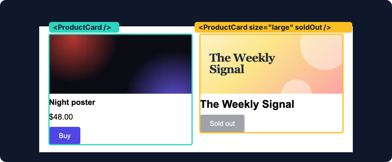
import {
  Button,
  Column,
  Heading,
  Image,
  Text,
  defineElement,
  prop,
} from "@hyper-elements/react";

export const ProductCard = defineElement({
  type: "acme.ProductCard",
  label: "Product card",
  props: {
    name: prop.text({ label: "Name", required: true }),
    photo: prop.image({ label: "Photo", required: true }),
    href: prop.link({ label: "Link", required: true }),
    price: prop.text({ label: "Price" }),
    accent: prop.color({ label: "Accent", default: "#4f46e5" }),
    size: prop.choice(["compact", "large"], {
      label: "Size",
      default: "compact",
    }),
    soldOut: prop.boolean({ label: "Sold out", default: false }),
  },
  render: ({ name, photo, href, price, accent, size, soldOut }) => (
    <Column style={{ gap: 8 }}>
      <Image src={photo} alt={name} />
      <Heading level={3} style={{ fontSize: size === "large" ? 22 : 16 }}>
        {name}
      </Heading>
      {price ? <Text>{price}</Text> : null}
      <Button
        href={href}
        style={{ backgroundColor: soldOut ? "#a1a1aa" : accent }}
      >
        {soldOut ? "Sold out" : "Buy"}
      </Button>
    </Column>
  ),
});
Use it like any element:
<Row style={{ gap: 16 }}>
  <ProductCard
    name="Night poster"
    photo={poster}
    href="https://example.com/p/1"
    price="$48.00"
  />
  <ProductCard
    name="The Weekly Signal"
    photo={weekly}
    href="https://example.com/p/2"
    size="large"
    soldOut
  />
</Row>
What it adds to a function
-
Its props are checked when the design is read, not only by TypeScript. A wrong value is a diagnostic with a path, like a built-in element’s, so it’s caught when the value comes from data, a JSON file or an AI agent:
error prop/invalid at root.children[0].props.size: size: expected one of "compact", "large", not "huge" -
Its defaults are filled in before
renderruns:accentis"#4f46e5"where an instance gives none. -
It stays one named block in the design. The command line’s
inspectlists it by itstype, with the props each instance gave:root.children[0].children[0] acme.ProductCard: props.name, props.photo, props.href, props.price -
Every output renders it. It’s replaced by the built-in elements its
renderreturns before the layout is worked out. -
Its props take a theme’s tokens:
<ProductCard accent={token("colors.primary")} />.
The spec
| Field | What it is |
|---|---|
type |
A namespace, a dot and a capitalized name: "acme.ProductCard". The namespace keeps it from clashing with built-in elements |
label |
Its name for people |
description |
Optional: what it’s for |
props |
Its props, made with prop.* |
placement |
"block" (the default) goes where a block goes. "section" goes where a Section goes, and renders a Section |
render |
The block as built-in elements, from its props with defaults applied |
render is a pure function of its props: no hooks, and nothing read from outside its props, so it renders anywhere. It returns one element, which takes your element’s place.
Its second argument is { theme }: the theme’s tokens as values where the instance is, scopes around it included (theme.colors.primary), for values render works out itself. It’s empty without a theme.
Props
| Helper | Takes |
|---|---|
prop.text() |
Text |
prop.color() |
A color |
prop.image() |
An image: a URL, or { src, width, height } |
prop.link() |
A link: a URL or a merge tag, or { href, target } |
prop.boolean() |
true or false |
prop.number() |
A number, with optional min, max and integer |
prop.length() |
A length, px by default |
prop.choice(values, …) |
One of values |
prop.fontFamily() |
A font stack |
prop.fontWeight() |
A font weight |
Each takes label, and optionally a description, required: true or a default. Their types carry through to render’s props and to the JSX. A color, length or font prop also takes a theme’s token in JSX, and render gets its value where the instance is.
On each instance
Beside its own props, an instance takes id, hidden, and style={{ flex }} for its share of a Row. Its flex and hidden go onto the element it renders. It takes no variant or named styles: apply those in what it renders.
An id inside a custom element is written after its instance’s: an id="photo" in the card is first-photo in <ProductCard id="first" />. Without an instance id, ids inside are left out (with an id/dropped note), so two instances never share an id.
A section-level element
With placement: "section", a custom element goes where a Section goes, and renders one:
import { Text, Section, defineElement, prop } from "@hyper-elements/react";

export const Banner = defineElement({
  type: "acme.Banner",
  label: "Banner",
  placement: "section",
  props: {
    text: prop.text({ label: "Text", required: true }),
    background: prop.color({ label: "Background", default: "#111827" }),
  },
  render: ({ text, background }) => (
    <Section
      style={{
        backgroundColor: background,
        padding: [16, 40],
        color: "#ffffff",
        textAlign: "center",
      }}
    >
      <Text>{text}</Text>
    </Section>
  ),
});
Html: markup as it is
Html is a built-in element, and the escape hatch: for markup no element writes, it writes yours as it is, in an email and on a page.
import { Email, Html } from "@hyper-elements/react";

<Email>
  <Html
    html={'<p style="margin:0">Written <b>as it is</b>.</p>'}
    text="Written as it is."
  />
</Email>
Or give the markup as JSX inside the block, which React writes:
<Html text="Written as JSX.">
  <p style={{ margin: 0 }}>Written <b>as JSX</b>.</p>
</Html>
text is what the block reads as in the plain-text version. Without it, the markup’s words are used. A Document’s PDF and a Canvas’s image can’t draw markup, so they draw that plain text, and say so.
Warning: Nothing in an
Htmlblock is checked or escaped. Put only markup you wrote there, never a customer’s data. Everywhere else, values you pass as children or props are escaped for you.
Inside an Html block, you’re back to writing email HTML yourself: tables for Outlook, inline styles, and testing in each client. Reach for it last.