Templates
Template examples
Four templates with their parts outlined, built step by step: a launch graphic in two sizes, an email with a locked header and footer around an open body, a newsletter with a limited body, and an invoice filled from data. Then the same from code.
Four templates, each with a picture of what’s locked and what’s open. All are real: the pictures and the output are what the commands on this page wrote. Templates says what a template is and what to install.
The launch graphic is the fullest, and walks through every command. For the shortest template, start with the email.
| Template | Its root | Locked | Open |
|---|---|---|---|
| Launch graphic | Canvas | The logo, each size’s layout, the colors and the fonts | Six fields: a headline, three features, a date, a language and two pictures |
| Orbit email | The header, the footer and its unsubscribe link | The body: any elements, written as JSX | |
| Newsletter | The header, the footer, the brand’s look | A subject, and a body of five kinds of element, with no styles of its own | |
| Orbit invoice | Document | The letterhead, the table, the total, the footer on every page | The customer, the number, the dates, the lines, a note: all data |
The examples are one project. Its templates are in templates/, its designs in designs/, and its package.json
lists the templates it trusts, so no design can name another one
(trusted templates):
{ "hyperElements": { "templates": ["templates/**"] } }A launch graphic in two sizes
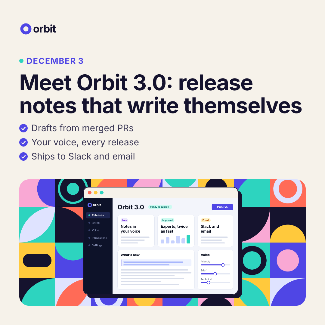
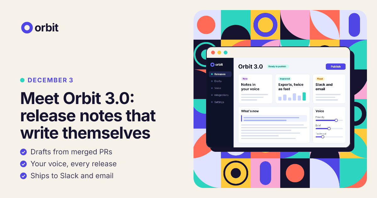
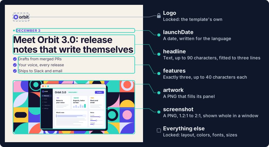
- Locked: the logo, each size’s layout, the colors and the fonts. No value can change them.
- Open: six fields, each with its limits: the headline, three features, a date, a language and two pictures.
- Still checked: the finished image. Nothing runs past the Canvas, every character has a font, and the headline fits.
- Formats: square and landscape. One set of values renders as both.
Write the template
A template is template({ … }): an id and a version, its formats, its fields, an example, and a render that builds
the design from the values. The fields say what’s open, each with its limits:
// from templates/launch-graphic.tsx
fields: {
  headline: prop.text({ label: "Headline", required: true, maxLength: 90 }),
  features: prop.list(prop.text({ label: "Feature", maxLength: 40 }), { label: "Features", required: true, min: 3, max: 3 }),
  launchDate: prop.date({ label: "Launch date", required: true }),
  locale: prop.choice(["en-US", "de-DE"], { label: "Language", default: "en-US" }),
  screenshot: field.image({ label: "Product screenshot", required: true, fit: "contain", aspect: { min: 1.2, max: 2 }, minWidth: 1000, accepts: ["png"] }),
  artwork: field.image({ label: "Artwork", required: true, fit: "cover", maxCrop: 0.6, accepts: ["png"], guidance: "Bold flat shapes in the brand's colors. No text, logos or people." }),
},
render gets the values and the format’s name. Whatever it writes that isn’t a field is fixed. A node says which
field it shows with field="…", which is how the template’s checks find it. The headline is
fitted text: drawn at the largest of its sizes that takes three lines or
fewer. What’s under it follows it.
// from templates/launch-graphic.tsx
<Heading field="headline" level={1} fit={{ sizes: [...f.headline], maxLines: 3 }} style={{ color: INK, lineHeight: 1.06, letterSpacing: -1.5 }}>
  {v.headline}
</Heading>
The rules over the result are one line. require.core names checks of Elements’ own, by their codes. Requiring one
means a design doesn’t pass until that check has run and found nothing. These three need the image measured:
laid out with its real fonts, which the command line does when it checks a design, and renderImage() when it draws
one. So no design passes on its values alone:
// from templates/launch-graphic.tsx
rules: { require: { core: ["image/overflow", "image/glyph", "image/fit"] } },
The whole template: templates/launch-graphic.tsx
// templates/launch-graphic.tsx
import { Canvas, Circle, Column, Heading, Image, Layer, Path, Rect, Row, Svg, Text, prop } from "@hyper-elements/react";
import { field, fitInside, formatDate, template } from "@hyper-elements/react/template";

// The brand's fonts and colors.
const FONTS = [
  { family: "Inter", src: "../fonts/Inter-Regular.ttf", weight: 400 },
  { family: "Inter", src: "../fonts/Inter-Bold.ttf", weight: 700 },
];
const [INK, PAPER, INDIGO, TEAL] = ["#15132e", "#f6f2ea", "#4f46e5", "#2dd4bf"];

// Each format's layout. It's the template's: no value changes it.
const LAYOUT = {
  square: { width: 1080, height: 1080, words: 952, headline: [72, 64, 56], text: 30, art: { width: 952, height: 420 }, shot: { width: 512, height: 320 } },
  landscape: { width: 1200, height: 630, words: 504, headline: [52, 46, 40], text: 23, art: { width: 552, height: 566 }, shot: { width: 456, height: 285 } },
} as const;

export default template({
  id: "acme.LaunchGraphic",
  version: "1.0.0",
  label: "Product launch graphic",
  guidance: "For product launches only. Sentence case, no emoji, no exclamation marks.",
  root: "Canvas",
  formats: { square: { width: 1080, height: 1080 }, landscape: { width: 1200, height: 630 } },
  fields: {
    headline: prop.text({ label: "Headline", required: true, maxLength: 90 }),
    features: prop.list(prop.text({ label: "Feature", maxLength: 40 }), { label: "Features", required: true, min: 3, max: 3 }),
    launchDate: prop.date({ label: "Launch date", required: true }),
    locale: prop.choice(["en-US", "de-DE"], { label: "Language", default: "en-US" }),
    screenshot: field.image({ label: "Product screenshot", required: true, fit: "contain", aspect: { min: 1.2, max: 2 }, minWidth: 1000, accepts: ["png"] }),
    artwork: field.image({ label: "Artwork", required: true, fit: "cover", maxCrop: 0.6, accepts: ["png"], guidance: "Bold flat shapes in the brand's colors. No text, logos or people." }),
  },
  // What only measuring decides has to hold: nothing past the Canvas, a font for every character, a headline that fits.
  rules: { require: { core: ["image/overflow", "image/glyph", "image/fit"] } },
  example: {
    headline: "Meet Orbit 3.0: release notes that write themselves",
    features: ["Drafts from merged PRs", "Your voice, every release", "Ships to Slack and email"],
    launchDate: "2026-12-03",
    screenshot: { src: "../designs/art/screenshot.png", width: 1600, height: 1000 },
    artwork: { src: "../designs/art/shapes.png", width: 1600, height: 1200 },
  },
  render(v, { format }) {
    const f = LAYOUT[format];
    const logo = <Image src={{ src: "./assets/orbit-logo.png", width: 252, height: 128 }} alt="Orbit" style={{ width: 126 }} />;
    const words = (
      <Column style={{ width: f.words, gap: 18 }}>
        {/* The date, written for the language, without its year. */}
        <Row style={{ gap: 10, alignItems: "center" }}>
          <Svg width={14} height={14}>
            <Circle cx={7} cy={7} r={7} style={{ fill: TEAL }} />
          </Svg>
          <Text field="launchDate" style={{ color: INDIGO, fontSize: f.text - 3, fontWeight: 700, lineHeight: 1.2, letterSpacing: 2, textTransform: "uppercase" }}>
            {formatDate(v.launchDate, v.locale, { month: "long", day: "numeric" })}
          </Text>
        </Row>
        {/* The headline is drawn at the largest size that fits it in three lines. What's under it follows it. */}
        <Heading field="headline" level={1} fit={{ sizes: [...f.headline], maxLines: 3 }} style={{ color: INK, lineHeight: 1.06, letterSpacing: -1.5 }}>
          {v.headline}
        </Heading>
        <Column style={{ gap: 8 }}>
          {v.features.map((feature, i) => (
            <Row key={i} style={{ gap: 12, alignItems: "center" }}>
              <Svg width={f.text - 2} height={f.text - 2} viewBox="0 0 24 24">
                <Circle cx={12} cy={12} r={12} style={{ fill: INDIGO }} />
                <Path d="M6.5 12.5 L10.5 16.5 L17.5 8.5" style={{ fill: "transparent", stroke: PAPER, strokeWidth: 2.6 }} />
              </Svg>
              <Text field={`features[${i}]`} style={{ color: "#3d3a57", fontSize: f.text, lineHeight: 1.3 }}>
                {feature}
              </Text>
            </Row>
          ))}
        </Column>
      </Column>
    );
    // The screenshot, shown whole in a window of the template's own, with the window's shadow behind it.
    const shot = fitInside(v.screenshot, f.shot);
    const [width, height] = [shot.width + 4, shot.height + 38];
    const product = (
      <Layer style={{ width: width + 12, height: height + 12, justifyItems: "start" }}>
        <Svg width={width + 12} height={height + 12}>
          <Rect x={12} y={12} width={width} height={height} rx={18} style={{ fill: INK }} />
        </Svg>
        <Column style={{ width, backgroundColor: PAPER, border: `2px solid ${INK}`, borderRadius: 18, overflow: "hidden" }}>
          <Row style={{ padding: [11, 14] }}>
            <Svg width={52} height={12}>
              <Circle cx={6} cy={6} r={6} style={{ fill: "#ff6b57" }} />
              <Circle cx={26} cy={6} r={6} style={{ fill: "#ffc93c" }} />
              <Circle cx={46} cy={6} r={6} style={{ fill: TEAL }} />
            </Svg>
          </Row>
          <Image field="screenshot" src={v.screenshot} alt="The product" style={shot} />
        </Column>
      </Layer>
    );
    // The artwork fills a panel, and the product sits in the middle of it.
    const art = (
      <Layer style={{ ...f.art, borderRadius: 32, alignItems: "center", justifyItems: "center" }}>
        <Image field="artwork" src={v.artwork} alt="" />
        {product}
      </Layer>
    );
    return (
      <Canvas width={f.width} height={f.height} fonts={FONTS} lang={v.locale} style={{ backgroundColor: PAPER, fontFamily: "Inter" }}>
        {format === "square" ? (
          // The logo at the top and the art at the bottom: the space around the words takes up the slack.
          <Column style={{ height: f.height, padding: 64, justifyContent: "space-between" }}>
            {logo}
            {words}
            {art}
          </Column>
        ) : (
          <Row style={{ height: f.height, padding: [32, 32, 32, 64], gap: 48 }}>
            <Column style={{ width: f.words, height: f.art.height, padding: [24, 0], justifyContent: "space-between" }}>
              {logo}
              {words}
            </Column>
            {art}
          </Row>
        )}
      </Canvas>
    );
  },
});
Make a design
A design gives the template its values. From the shell, design new makes one from a brief (brief.json, the
values that are text) and the launch’s pictures. --set name=@file gives an image by its file:
npx hyper-elements design new templates/launch-graphic.tsx -o designs/orbit.values.json \
--values brief.json --set screenshot=@designs/art/screenshot.png --set artwork=@designs/art/shapes.pngbrief.json:
{
  "headline": "Meet Orbit 3.0: release notes that write themselves",
  "features": ["Drafts from merged PRs", "Your voice, every release", "Ships to Slack and email"],
  "launchDate": "2026-12-03"
}
It writes designs/orbit.values.json, a values file. That file is the design:
{
  "version": 1,
  "template": {
    "module": "../templates/launch-graphic.tsx",
    "id": "acme.LaunchGraphic",
    "version": "1.0.0",
    "sha256": "dbaf51a5c359…"
  },
  "formats": [
    "square",
    "landscape"
  ],
  "values": {
    "headline": "Meet Orbit 3.0: release notes that write themselves",
    "features": [
      "Drafts from merged PRs",
      "Your voice, every release",
      "Ships to Slack and email"
    ],
    "launchDate": "2026-12-03",
    "locale": "en-US",
    "screenshot": {
      "src": "./art/screenshot.png",
      "width": 1600,
      "height": 1000
    },
    "artwork": {
      "src": "./art/shapes.png",
      "width": 1600,
      "height": 1200
    }
  },
  "assets": {
    "screenshot": {
      "sha256": "e6d0855049bd…"
    },
    "artwork": {
      "sha256": "196b33139609…"
    }
  }
}versionis the file format’s own:1.templateis the module it’s made from (relative to this file), with its id and version, and a hash of the module as it was, so a template changed under the same version is noticed.formatsare the ones it renders in. Take one out to render fewer.valuesare the brief’s, the template’s defaults (locale), and each picture with its size, read from its file.assetsrecords each picture’s hash, and where it came from once that’s given.
The template checked the values before the file was written. Any program can write a values file of this shape: it’s checked again, by its template, every time it’s read. Values as data says which keys one needs.
As TSX (designs/orbit.tsx, say), the same design is the template as its root, with the values as its props.
TypeScript checks them as they’re written: a missing required field, a field the template doesn’t have and a number given for text are type errors.
import Launch from "../templates/launch-graphic";

export default () => (
  <Launch
    headline="Meet Orbit 3.0: release notes that write themselves"
    features={["Drafts from merged PRs", "Your voice, every release", "Ships to Slack and email"]}
    launchDate="2026-12-03"
    screenshot={{ src: "./art/screenshot.png", width: 1600, height: 1000 }}
    artwork={{ src: "./art/shapes.png", width: 1600, height: 1200 }}
  />
);
The command line checks and renders a TSX design as it does a values file, in every format. A format="square" prop
picks one. The same from code renders one without the command line.
Check it, then render it
npx hyper-elements check designs/orbit.values.json✓ designs/orbit.values.json [square] (Canvas)
artwork (square): 952×420, needs 952×420px
screenshot (square): 512×320, needs 512×320px
fit headline: 72px (fits at 72, 64, 56)
review artwork: Bold flat shapes in the brand's colors. No text, logos or people.
review acme.LaunchGraphic: For product launches only. Sentence case, no emoji, no exclamation marks.
review screenshot: Of unknown origin: no source is recorded for this image (give one with design set … --source)
review artwork: Of unknown origin: no source is recorded for this image (give one with design set … --source)
✓ designs/orbit.values.json [landscape] (Canvas)
artwork (landscape): 552×566, needs 552×566px
screenshot (landscape): 456×285, needs 456×285px
fit headline: 52px (fits at 52, 46, 40)
review artwork: Bold flat shapes in the brand's colors. No text, logos or people.
review acme.LaunchGraphic: For product launches only. Sentence case, no emoji, no exclamation marks.
review screenshot: Of unknown origin: no source is recorded for this image (give one with design set … --source)
review artwork: Of unknown origin: no source is recorded for this image (give one with design set … --source)
2 designs: 0 errors, 0 warnings, 0 skippedEach format is checked on its own, and counts as a design in the last line: the values, the design the template builds, and what can only be known by measuring it with its fonts.
fit headlineis the size the headline is drawn at.- Each picture’s line is its region and the pixels it needs.
reviewlists what a person judges, which never fails a run: the template’sguidance, and each picture with no record of where it came from, so a reviewer can tell a generated picture from a supplied one.design set … --source artwork=source.jsonrecords one (sources).
npx hyper-elements render designs/orbit.values.json✓ designs/orbit.values.json [square] (Canvas) → out/designs/orbit.square.png
✓ designs/orbit.values.json [landscape] (Canvas) → out/designs/orbit.landscape.png
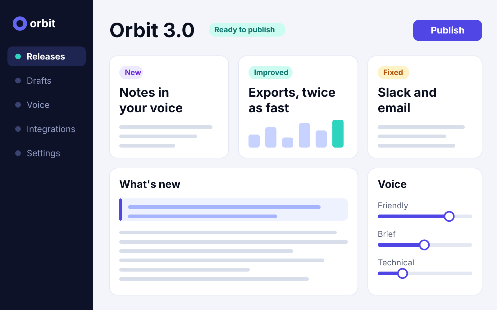
2 designs: 0 errors, 0 warnings, 0 skippedThose are the two images above.
Change one value
design set changes one value and keeps the rest. The template fits the new headline:
npx hyper-elements design set designs/orbit.values.json "headline=Meet Orbit 3.0: release notes that write themselves, in your voice"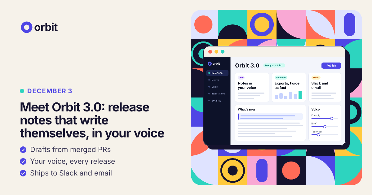
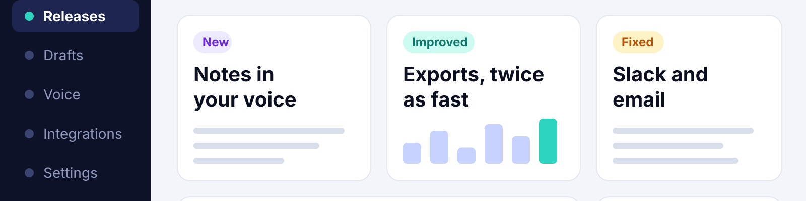
The landscape format’s headline is narrow, so it’s drawn at 40px, not 52px, in the same three lines. The date stays right above it and the features right under it: the block is only as tall as its words. The square format still takes it at 72px.
Values it refuses
A picture of the wrong shape. The screenshot is 1.2:1 to 2:1. A banner in its place is refused when it’s set, and the file stays as it was:
npx hyper-elements design set designs/orbit.values.json screenshot=@designs/art/banner.png✗ designs/orbit.values.json: not written
error template/asset-aspect at values.screenshot: Product screenshot is 1600×400, 4:1; it takes 2:1 or narrowerCopy that can’t fit. A headline inside its 90 characters can still be too long for the landscape format’s three
lines at its smallest size. That’s found when the design is measured: check exits 1, and render writes nothing for
a format that fails. The error’s count of characters to cut is a rough estimate.
npx hyper-elements design set designs/orbit.values.json "headline=Meet Orbit 3.0: release notes that write themselves, in your own voice"
npx hyper-elements check designs/orbit.values.json
✓ designs/orbit.values.json [square] (Canvas)
artwork (square): 952×420, needs 952×420px
screenshot (square): 512×320, needs 512×320px
fit headline: 64px (fits at 64, 56)
review artwork: Bold flat shapes in the brand's colors. No text, logos or people.
review acme.LaunchGraphic: For product launches only. Sentence case, no emoji, no exclamation marks.
review screenshot: Of unknown origin: no source is recorded for this image (give one with design set … --source)
review artwork: Of unknown origin: no source is recorded for this image (give one with design set … --source)
✗ designs/orbit.values.json [landscape] (Canvas)
error image/fit at root.children[0].children[0].children[1].children[1]: This Heading doesn't fit: it takes 4 lines at 40px, its smallest size, and fits 3: cut about 18 characters (required by acme.LaunchGraphic) Fix: Shorten the text, or give the template a smaller size
rule image/fit (landscape): failed
artwork (landscape): 552×566, needs 552×566px
screenshot (landscape): 456×285, needs 456×285px
fit headline: no size fits
review artwork: Bold flat shapes in the brand's colors. No text, logos or people.
review acme.LaunchGraphic: For product launches only. Sentence case, no emoji, no exclamation marks.
review screenshot: Of unknown origin: no source is recorded for this image (give one with design set … --source)
review artwork: Of unknown origin: no source is recorded for this image (give one with design set … --source)
2 designs: 1 error, 0 warnings, 0 skippedAn email with a locked header and footer
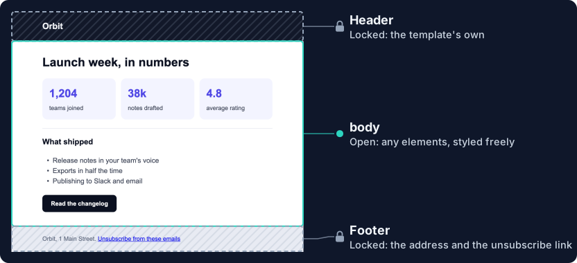
- Locked: the header and the footer. They’re written in the template, so no email can change or drop them.
- Open: the body. It’s a slot that takes any element, styled freely. Whoever writes the email, a person or an agent, writes only this.
- Still checked: the finished email, whatever the body holds. Its links go to Orbit’s own domains, it has an unsubscribe link, and nothing is wider than the email.
The slot is one field, render places it between the two locked sections, and the rules hold whatever is written
there:
// from templates/brand-email.tsx
fields: {
  preview: prop.text({ label: "Preview text", required: true, maxLength: 120 }),
  // Open: any element, styled freely. Whoever writes the email, a person or an agent, writes this.
  body: field.slot({ label: "Body", required: true, allow: "all", styles: "free" }),
},
// from templates/brand-email.tsx
{/* Locked: the header. */}
<Section id="header" style={{ backgroundColor: "#0b1020", padding: [20, 32] }}>
<Text style={{ color: "#ffffff", fontSize: 20, fontWeight: 700 }}>Orbit</Text>
</Section>
{/* Open: the body. */}
<Section id="body" field="body" style={{ backgroundColor: "#ffffff", padding: 32 }}>
{v.body}
</Section>
{/* Locked: the footer, with the unsubscribe link every email needs. */}
<Section id="footer" style={{ padding: [20, 32] }}>// from templates/brand-email.tsx
rules: {
plugins: { lint: lint({ kind: "marketing" }) },
require: { lint: ["unsubscribe"], core: ["layout/overflow"] },
links: { domains: ["orbit.example", "*.orbit.example"] },
},The whole template: templates/brand-email.tsx
// templates/brand-email.tsx
import { Email, Link, Section, Text, prop } from "@hyper-elements/react";
import { field, template } from "@hyper-elements/react/template";
import { lint } from "@hyper-elements/lint";

export default template({
  id: "acme.BrandEmail",
  version: "1.0.0",
  label: "Orbit email",
  guidance: "Any email Orbit sends. The header and footer are Orbit's; the body is yours.",
  root: "Email",
  fields: {
    preview: prop.text({ label: "Preview text", required: true, maxLength: 120 }),
    // Open: any element, styled freely. Whoever writes the email, a person or an agent, writes this.
    body: field.slot({ label: "Body", required: true, allow: "all", styles: "free" }),
  },
  // Checked on the finished email, whatever the body holds.
  rules: {
    plugins: { lint: lint({ kind: "marketing" }) },
    require: { lint: ["unsubscribe"], core: ["layout/overflow"] },
    links: { domains: ["orbit.example", "*.orbit.example"] },
  },
  example: {
    preview: "A short note from the team at Orbit, with what changed this week",
    body: <Text>Hello from Orbit.</Text>,
  },
  render(v) {
    return (
      <Email lang="en" previewText={v.preview} style={{ backgroundColor: "#eef0f6" }}>
        {/* Locked: the header. */}
        <Section id="header" style={{ backgroundColor: "#0b1020", padding: [20, 32] }}>
          <Text style={{ color: "#ffffff", fontSize: 20, fontWeight: 700 }}>Orbit</Text>
        </Section>
        {/* Open: the body. */}
        <Section id="body" field="body" style={{ backgroundColor: "#ffffff", padding: 32 }}>
          {v.body}
        </Section>
        {/* Locked: the footer, with the unsubscribe link every email needs. */}
        <Section id="footer" style={{ padding: [20, 32] }}>
          <Text style={{ fontSize: 14, color: "#5b6478" }}>
            Orbit, 1 Main Street. <Link href="https://orbit.example/unsubscribe">Unsubscribe from these emails</Link>
          </Text>
        </Section>
      </Email>
    );
  },
});
Two emails, one template
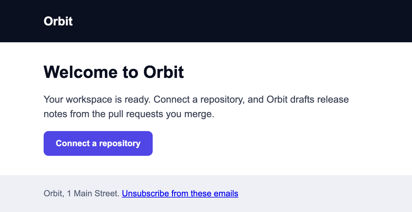
An email is the template with a body. These two share nothing but the template:
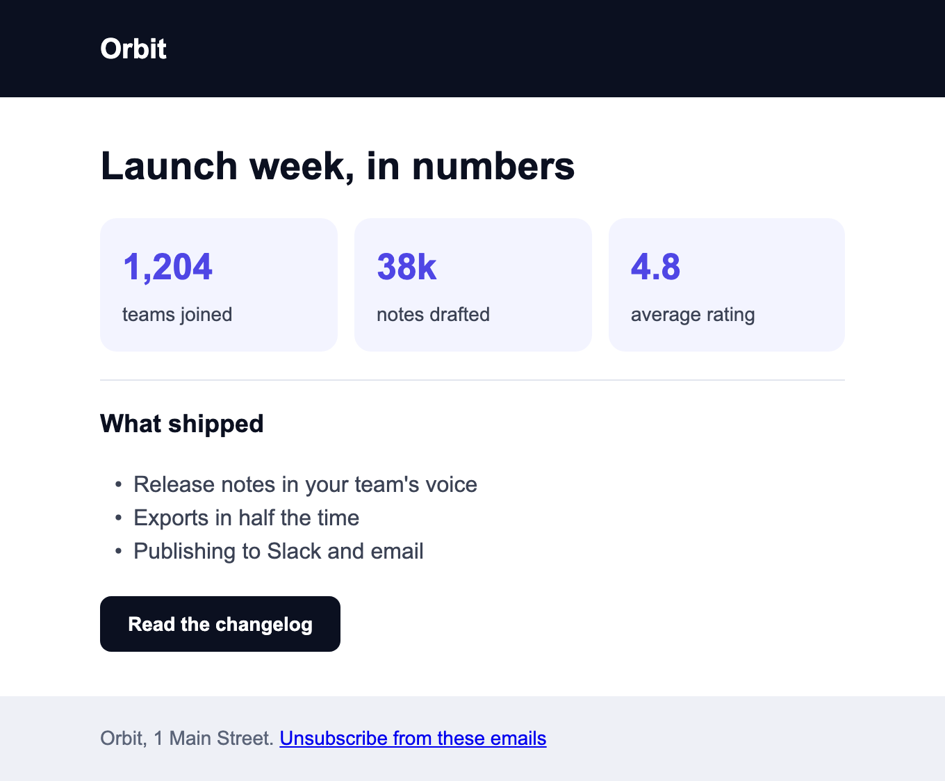
// designs/welcome.tsx
import { Button, Column, Heading, Text } from "@hyper-elements/react";
import BrandEmail from "../templates/brand-email";

export default () => (
  <BrandEmail
    preview="Your workspace is ready: here's how to publish your first release notes"
    body={
      <Column style={{ gap: 16 }}>
        <Heading level={1} style={{ fontSize: 28, color: "#0b1020" }}>Welcome to Orbit</Heading>
        <Text style={{ color: "#3b4254" }}>Your workspace is ready. Connect a repository, and Orbit drafts release notes from the pull requests you merge.</Text>
        <Button href="https://orbit.example/start" style={{ backgroundColor: "#4f46e5", color: "#ffffff", borderRadius: 8, padding: [12, 20], fontWeight: 700 }}>Connect a repository</Button>
      </Column>
    }
  />
);
The other email: designs/launch-week.tsx
// designs/launch-week.tsx
import { Button, Column, Divider, Heading, List, ListItem, Row, Text } from "@hyper-elements/react";
import BrandEmail from "../templates/brand-email";

const stat = (figure: string, label: string) => (
  <Column style={{ backgroundColor: "#f3f4ff", borderRadius: 12, padding: 16, gap: 4 }}>
    <Text style={{ fontSize: 26, fontWeight: 700, color: "#4f46e5" }}>{figure}</Text>
    <Text style={{ fontSize: 14, color: "#3b4254" }}>{label}</Text>
  </Column>
);

export default () => (
  <BrandEmail
    preview="Launch week in numbers, what shipped, and what's next for Orbit"
    body={
      <Column style={{ gap: 20 }}>
        <Heading level={1} style={{ fontSize: 28, color: "#0b1020" }}>Launch week, in numbers</Heading>
        <Row style={{ gap: 12 }}>
          {stat("1,204", "teams joined")}
          {stat("38k", "notes drafted")}
          {stat("4.8", "average rating")}
        </Row>
        <Divider style={{ borderTop: "1px solid #e2e5ee" }} />
        <Heading level={2} style={{ fontSize: 18, color: "#0b1020" }}>What shipped</Heading>
        <List style={{ color: "#3b4254" }}>
          <ListItem>Release notes in your team's voice</ListItem>
          <ListItem>Exports in half the time</ListItem>
          <ListItem>Publishing to Slack and email</ListItem>
        </List>
        <Button href="https://orbit.example/changelog" style={{ backgroundColor: "#0b1020", color: "#ffffff", borderRadius: 8, padding: [12, 20], fontWeight: 700 }}>Read the changelog</Button>
      </Column>
    }
  />
);
npx hyper-elements render designs/welcome.tsx designs/launch-week.tsxEach is checked by the template, then written as HTML and plain text (out/designs/welcome.html and
welcome.txt). The pictures are that HTML in Chromium.
What the open body can’t do
The body is open; the template’s rules over the result aren’t. An email that links outside Orbit’s domains is refused, with the link that broke the rule:
// designs/off-site.tsx
import { Button, Column, Text } from "@hyper-elements/react";
import BrandEmail from "../templates/brand-email";

export default () => (
  <BrandEmail
    preview="A partner offer for Orbit customers, for a short time, from a friend of ours"
    body={
      <Column style={{ gap: 16 }}>
        <Text>Our friends at Northwind have an offer for Orbit customers.</Text>
        <Button href="https://northwind.example.net/offer">See the offer</Button>
      </Column>
    }
  />
);
npx hyper-elements check designs/off-site.tsx✗ designs/off-site.tsx (Email)
error template/link-domain at root.children[1].children[0].children[1].props.href: northwind.example.net isn't one of acme.BrandEmail's domains (orbit.example, *.orbit.example) (required by acme.BrandEmail)
rule links: failed
review acme.BrandEmail: Any email Orbit sends. The header and footer are Orbit's; the body is yours.
1 design: 1 error, 0 warnings, 0 skippedSo whoever writes an email writes only its body: the header, the footer and the rules are the template’s. In CI,
--require-template acme.BrandEmail fails any email that wasn’t made from it.
A body written as JSX is code, though, and the command line runs it. Review these designs as you review any code. For an agent whose work nobody reviews, use a template whose open parts are data, such as the invoice below or a digest of blocks: a values file runs nothing. See what trusted templates guarantee.
To open less, list the elements a slot takes and keep its styles to the brand’s, as the next example does.
A newsletter with a limited body
The email above opens its body completely. This newsletter’s slot is narrow: the header and footer are locked, and
the body takes five kinds of element, in the brand’s look, with one or two buttons. Its subject field is the title
drawn at the top of the email; the subject an inbox shows is set where the email is sent.
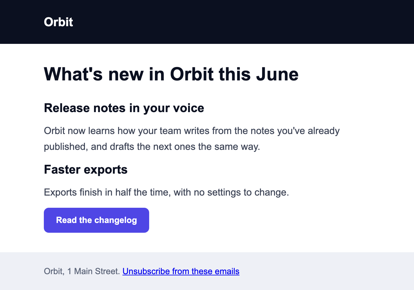
The issue is the template with its values. What’s inside body is the writer’s:
// designs/june.tsx
import { Button, Column, Heading, Text } from "@hyper-elements/react";
import Newsletter from "../templates/newsletter";

export default () => (
  <Newsletter
    subject="What's new in Orbit this June"
    preview="Release notes in your voice, faster exports, and an invitation to our open house"
    body={
      <Column>
        <Heading level={2}>Release notes in your voice</Heading>
        <Text>Orbit now learns how your team writes from the notes you've already published, and drafts the next ones the same way.</Text>
        <Heading level={2}>Faster exports</Heading>
        <Text>Exports finish in half the time, with no settings to change.</Text>
        <Button href="https://orbit.example/changelog">Read the changelog</Button>
      </Column>
    }
  />
);
An issue that styles its own heading and adds a table is refused, with what to change:
npx hyper-elements check designs/off-brand.tsx✗ designs/off-brand.tsx (Email)
error template/slot-style at root.children[2].children[0].children[0].style.color: acme.Newsletter's body takes no styles of its own (styles: "none"): use the theme's named styles (style={{ apply: [...] }}) and variants, not color
error template/slot-element at root.children[2].children[0].children[1]: A Table isn't one of the elements acme.Newsletter's body takes (Column, Heading, Text, Button, Link)
review body: One to three short sections, each a Heading and a Text.
review acme.Newsletter: Orbit's monthly newsletter. Friendly and plain: sentence case, no exclamation marks, no emoji.
1 design: 1 error, 0 warnings, 0 skippedContent: slots and blocks has the whole newsletter template and every option.
An invoice filled from data
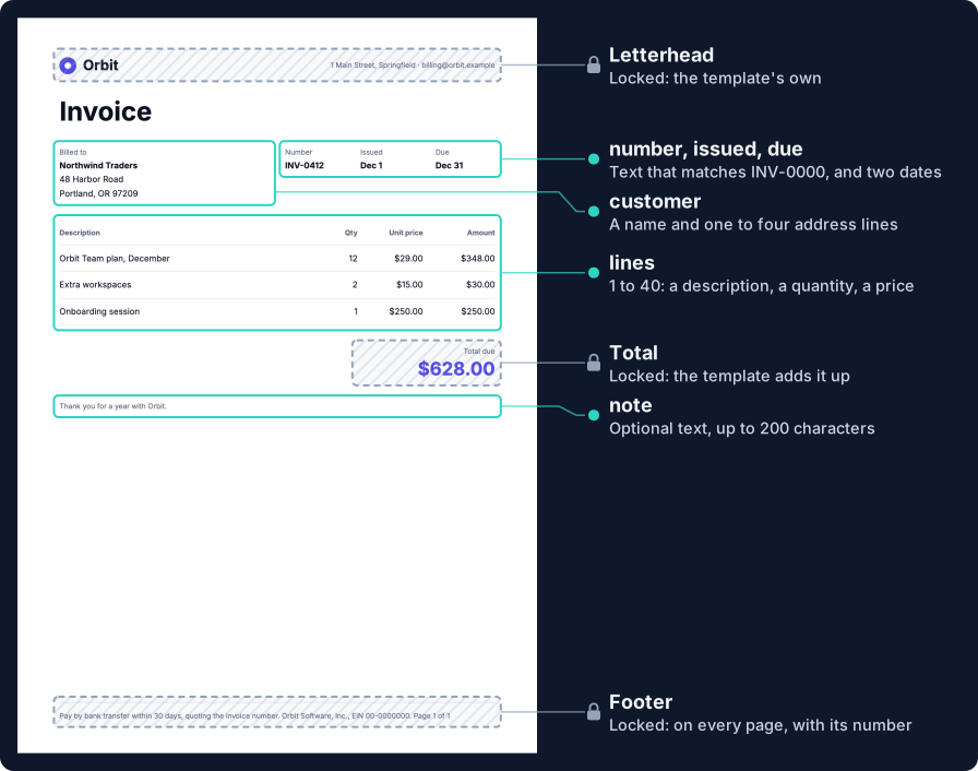
- Locked: the letterhead, the table’s columns, the total and the footer on every page, with its page number. The template adds the lines up, so a total is never typed.
- Open: fields, all of them data. A billing system or an agent writes an invoice’s values as JSON, and never writes layout.
- Formats: A4 and Letter. One invoice renders as both.
// from templates/invoice.tsx
formats: { a4: { size: "A4" }, letter: { size: "Letter" } },
// Open: what changes from one invoice to the next. All of it is data.
fields: {
  number: prop.text({ label: "Invoice number", required: true, pattern: "^INV-\\d{4}$" }),
  issued: prop.date({ label: "Issued", required: true }),
  due: prop.date({ label: "Due", required: true }),
The locked sum is ordinary code in render:
// from templates/invoice.tsx
// Locked: the sums. The template adds them up, so a total is never typed.
const total = v.lines.reduce((sum, line) => sum + line.quantity * line.price, 0);
The whole template: templates/invoice.tsx
// templates/invoice.tsx
import { Circle, Column, Document, Heading, PageFooter, PageNumber, Row, Svg, Table, TableCell, TableRow, Text, prop } from "@hyper-elements/react";
import { formatDate, template } from "@hyper-elements/react/template";

const FONTS = [
  { family: "Inter", src: "../fonts/Inter-Regular.ttf", weight: 400 },
  { family: "Inter", src: "../fonts/Inter-Bold.ttf", weight: 700 },
];
const money = new Intl.NumberFormat("en-US", { style: "currency", currency: "USD" });
const quiet = { fontSize: 11, color: "#5b6478" } as const;
const cell = { padding: [10, 0], border: { bottom: "1px solid #e2e5ee" } } as const;
const right = { ...cell, textAlign: "right" } as const;

/** A label over one field's value. */
const fact = (name: string, field: string, value: string) => (
  <Column style={{ gap: 2 }}>
    <Text style={quiet}>{name}</Text>
    <Text field={field} style={{ fontWeight: 700 }}>{value}</Text>
  </Column>
);

export default template({
  id: "acme.Invoice",
  version: "1.0.0",
  label: "Orbit invoice",
  guidance: "One invoice per customer per month. Describe each line as the customer's plan names it.",
  root: "Document",
  formats: { a4: { size: "A4" }, letter: { size: "Letter" } },
  // Open: what changes from one invoice to the next. All of it is data.
  fields: {
    number: prop.text({ label: "Invoice number", required: true, pattern: "^INV-\\d{4}$" }),
    issued: prop.date({ label: "Issued", required: true }),
    due: prop.date({ label: "Due", required: true }),
    customer: prop.object(
      {
        name: prop.text({ label: "Name", required: true, maxLength: 60 }),
        address: prop.list(prop.text({ label: "Address line", maxLength: 60 }), { label: "Address", required: true, min: 1, max: 4 }),
      },
      { label: "Billed to", required: true },
    ),
    lines: prop.list(
      prop.object(
        {
          description: prop.text({ label: "Description", required: true, maxLength: 80 }),
          quantity: prop.number({ label: "Quantity", required: true, min: 1 }),
          price: prop.number({ label: "Unit price", required: true, min: 0 }),
        },
        { label: "Line" },
      ),
      { label: "Lines", required: true, min: 1, max: 40 },
    ),
    note: prop.text({ label: "Note", maxLength: 200 }),
  },
  example: {
    number: "INV-0412",
    issued: "2026-12-01",
    due: "2026-12-31",
    customer: { name: "Northwind Traders", address: ["48 Harbor Road", "Portland, OR 97209"] },
    lines: [
      { description: "Orbit Team plan, December", quantity: 12, price: 29 },
      { description: "Extra workspaces", quantity: 2, price: 15 },
    ],
  },
  render(v, { format }) {
    // Locked: the sums. The template adds them up, so a total is never typed.
    const total = v.lines.reduce((sum, line) => sum + line.quantity * line.price, 0);
    return (
      <Document size={format === "letter" ? "Letter" : "A4"} margin={[56, 64, 48, 64]} title={`Invoice ${v.number}, Orbit`} lang="en" fonts={FONTS} style={{ backgroundColor: "#ffffff", fontFamily: "Inter", fontSize: 13, color: "#0b1020" }}>
        <Document.Page style={{ gap: 32 }}>
          {/* Locked: the letterhead. */}
          <Row id="letterhead" style={{ alignItems: "center" }}>
            <Row style={{ alignItems: "center", gap: 10 }}>
              <Svg width={26} height={26} title="Orbit">
                <Circle cx={13} cy={13} r={9} style={{ fill: "transparent", stroke: "#4f46e5", strokeWidth: 8 }} />
              </Svg>
              <Text style={{ fontSize: 22, fontWeight: 700 }}>Orbit</Text>
            </Row>
            <Column>
              <Text style={{ ...quiet, textAlign: "right" }}>1 Main Street, Springfield · billing@orbit.example</Text>
            </Column>
          </Row>

          <Heading level={1} style={{ fontSize: 40, lineHeight: 1.1 }}>Invoice</Heading>

          <Row style={{ alignItems: "start", gap: 24 }}>
            <Column id="customer" field="customer" style={{ gap: 2 }}>
              <Text style={quiet}>Billed to</Text>
              <Text style={{ fontWeight: 700 }}>{v.customer.name}</Text>
              {v.customer.address.map((line, i) => (
                <Text key={i}>{line}</Text>
              ))}
            </Column>
            <Row id="details" style={{ gap: 24 }}>
              {fact("Number", "number", v.number)}
              {fact("Issued", "issued", formatDate(v.issued, "en-US", { month: "short", day: "numeric" }))}
              {fact("Due", "due", formatDate(v.due, "en-US", { month: "short", day: "numeric" }))}
            </Row>
          </Row>

          <Table id="lines" field="lines">
            <TableRow header>
              <TableCell style={{ ...cell, ...quiet }}>Description</TableCell>
              <TableCell style={{ ...right, ...quiet, width: 60 }}>Qty</TableCell>
              <TableCell style={{ ...right, ...quiet, width: 100 }}>Unit price</TableCell>
              <TableCell style={{ ...right, ...quiet, width: 110 }}>Amount</TableCell>
            </TableRow>
            {v.lines.map((line, i) => (
              <TableRow key={i}>
                <TableCell style={cell}>{line.description}</TableCell>
                <TableCell style={right}>{String(line.quantity)}</TableCell>
                <TableCell style={right}>{money.format(line.price)}</TableCell>
                <TableCell style={right}>{money.format(line.quantity * line.price)}</TableCell>
              </TableRow>
            ))}
          </Table>

          <Column style={{ alignItems: "end" }}>
            <Column id="total" style={{ width: 210, gap: 2 }}>
              <Text style={{ ...quiet, textAlign: "right" }}>Total due</Text>
              <Text style={{ fontSize: 28, fontWeight: 700, lineHeight: 1.2, textAlign: "right", color: "#4f46e5" }}>{money.format(total)}</Text>
            </Column>
          </Column>

          {v.note ? <Text id="note" field="note" style={quiet}>{v.note}</Text> : null}
        </Document.Page>

        {/* Locked: the footer, on every page. */}
        <PageFooter id="footer">
          <Text style={{ ...quiet, padding: [12, 0, 0], border: { top: "1px solid #e2e5ee" } }}>
            Pay by bank transfer within 30 days, quoting the invoice number. Orbit Software, Inc., EIN 00-0000000. Page <PageNumber /> of <PageNumber total />
          </Text>
        </PageFooter>
      </Document>
    );
  },
});
Make one, and render it
The invoice’s values, as a billing system would write them (invoice.json). design new checks them and writes the
invoice’s values file:
{
  "number": "INV-0412",
  "issued": "2026-12-01",
  "due": "2026-12-31",
  "customer": { "name": "Northwind Traders", "address": ["48 Harbor Road", "Portland, OR 97209"] },
  "lines": [
    { "description": "Orbit Team plan, December", "quantity": 12, "price": 29 },
    { "description": "Extra workspaces", "quantity": 2, "price": 15 },
    { "description": "Onboarding session", "quantity": 1, "price": 250 }
  ],
  "note": "Thank you for a year with Orbit."
}
npx hyper-elements design new templates/invoice.tsx -o designs/northwind.values.json --values invoice.json✓ designs/northwind.values.json
set number
set issued
set due
set customer
set lines
set notenpx hyper-elements render designs/northwind.values.json --html✓ designs/northwind.values.json [a4] (Document) → out/designs/northwind.a4.pdf, out/designs/northwind.a4.html
✓ designs/northwind.values.json [letter] (Document) → out/designs/northwind.letter.pdf, out/designs/northwind.letter.html
2 designs: 0 errors, 0 warnings, 0 skippedOne PDF per format, drawn with @react-pdf/renderer. --html also writes each as print HTML, which is the page
pictured above, as Chromium draws it.
What the invoice refuses
A number that isn’t an invoice number is refused when it’s set, and the file stays as it was:
npx hyper-elements design set designs/northwind.values.json number=NW-12✗ designs/northwind.values.json: not written
error template/value at values.number: Invoice number: doesn't match ^INV-\d{4}$A list of lines that’s empty, a missing customer and a date that isn’t one are refused the same way. Values: fields, images and formats lists every kind of field and its rules.
The same from code
Nothing above needs the command line. This script renders an email whose root is a template, then checks a launch’s values and draws the image:
// scripts/render.tsx
import { mkdirSync, readFileSync, writeFileSync } from "node:fs";
import { formatDiagnostics, render } from "@hyper-elements/react";
import { renderImage } from "@hyper-elements/react/image";
import Welcome from "../designs/welcome";
import Launch from "../templates/launch-graphic";

const bytes = (path: string) => new Uint8Array(readFileSync(path));
mkdirSync("out", { recursive: true });

// An email. The design's root is the template, so render() hands it to the template, which checks it first.
// A design the template refuses rejects here, with its problems.
const { html } = await render(<Welcome />);
writeFileSync("out/welcome.html", html);

// An image. Check the values, then draw the snapshot the check returned: what was checked is what's drawn.
const values = {
  headline: "Meet Orbit 3.0: release notes that write themselves",
  features: ["Drafts from merged PRs", "Your voice, every release", "Ships to Slack and email"],
  launchDate: "2026-12-03",
  screenshot: { src: "screenshot.png", width: 1600, height: 1000 },
  artwork: { src: "shapes.png", width: 1600, height: 1200 },
};
const checked = Launch.check(values, { format: "square" });
if (!checked.valid) throw new Error(formatDiagnostics(checked.diagnostics));

// Nothing is fetched: give each font the design names, and each image by the src it's written with.
const { image } = await renderImage(checked.snapshots.square!, {
  fonts: [
    { family: "Inter", src: bytes("fonts/Inter-Regular.ttf"), weight: 400 },
    { family: "Inter", src: bytes("fonts/Inter-Bold.ttf"), weight: 700 },
  ],
  images: {
    "screenshot.png": bytes("designs/art/screenshot.png"),
    "shapes.png": bytes("designs/art/shapes.png"),
    "./assets/orbit-logo.png": bytes("templates/assets/orbit-logo.png"),
  },
});
writeFileSync("out/launch.png", image);render()takes a design whose root is a template as it takes any design. So dovalidate(),renderPdf()(from@hyper-elements/react/pdf) andrenderImage(): each hands the root to the template, and goes on with what it built. A design the template refuses rejects there with anElementsError, as any design with errors does.check()never throws. It returns the problems, and a snapshot of the checked design for each format: draw that, and what was checked is what’s drawn.- Fonts and images are given as bytes. An image’s key is the
srcthe design names it by: the value’s own, and the template’s logo as the template wrote it. renderImage()measures as it draws, so the template’s measured rules are decided there: a headline that doesn’t fit rejects. There’s nothing else to call.
Rules, checks and diagnostics has everything check() returns.